Wednesday, August 15, 2007
Global Learners Indentity
A friend of mine has been working up some sketches for possible ways to get our identity across (as a group of cutting edge educators). He has put together some rough sketches of letters and different images. This includes everything and is rough (his words). He wanted to make sure we had a chance to see everything he has worked on so far. Once we develop an identity/logo we will use that for our websites and communication media (business cards).
Subscribe to:
Post Comments (Atom)


13 comments:
Wow! What a plethora of ideas! I like the sketches that are unique and do not resemble other organizations. I sort of like the two keys G L. Whatever gets selected is alright with me, though. Thanks!
Several of them are very good. I liked the picture of the eyes with G and L on them. The logo looks to be owls' eyes. Owl eyes inset with G and L would be unique.
I, too, am fine with whatever the consensus is.
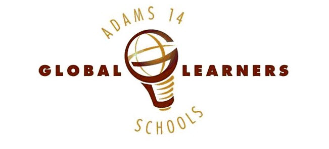
I like the look of the lightbulb that had "G" forming the shape of the bulb, and the "L" forming the shape of the socket. What if the bulb part was an image of the globe, similar to the Groupwise icon? I am thinking of what it would look like if a globe were etched onto the surface of a lightbulb.
TD
I like Tom's idea of the globe. That would seem more like we're global .
I like the image that looks like the curvature of the earth with the sun coming up behind it. The lightbulb is great as well. I also like the "L"s combined to make steps. Exciting!
Great to see the thought process. I like the light buld with the big G on the bulb and the L outlining the bottom of the lightbulb. I like the idea of a lightbulb mixed with the globe!
cbcalli4uI like the lightbulb that resembles the globe. All are very creative. Many choices..
I too am a fan of the images that incorporate the globe. I like most of the lettering styles on the first page better than those on the second. I also liked the question marks.
I too like Tom's idea of the lightbulb with the bulb as the globe and the threads with the L; however I'd like to see the red around arrow of the groupwise icon changed more to look like the gold swoop of the internet 7 icon.
I really like the globe that forms a light bulb on the rightside-middle of the first page. And the Words Global Learners with the "LL" forming a step. Kind of the same as Jeff. Thanks for asking.
I really dig the globe idea, a cool 3-D sphere with the words Global Learner, of maybe just Learner, with the Global part being implied by the globe image?
I concur with Tom D's idea.
I also like the lightbulb with the globe and the globaL Learners with the Ls forming steps, and the curved line that looks like the earth with the sun coming over the edge. Perhaps a bit more abstract than the light bulb/globe.
Post a Comment